March 26, 2019
Authors

When a product issue arises, the first sign is often product returns from the field, either through warranty claims or from dissatisfied customers. Evaluating trends in field returns can help manufacturers identify the root cause of product failure and take corrective action if needed to address design or manufacturing issues.
Simply analyzing field return data on the number of returns coming in over time can be misleading, as a return date (e.g., the date at which the product was returned by the customer) is likely later than the date of actual failure. Increasing or aging product populations in the field can also contribute to higher return rates over time. In contrast, manufacturers who analyze failure by production date are better positioned to reach actionable conclusions. Manufacturers can also couple production/return charts with Weibull curves to understand the density and distribution of returned units and the time to failure, respectively. The combination of both techniques can help manufacturers understand the drivers behind field returns and take steps to improve quality.
Our team at Exponent frequently uses production/return charts to help manufacturers visualize and interpret return data. The x-axis of a production/return chart represents the manufacturing date, or the date that the product was produced at the factory. While this is not always the same as the date the product was put into service, it can be an effective proxy for service entry if the supply chain is well known. The y-axis represents years to failure. Product returns are plotted as points, all of which must fall on or below a diagonal line that stretches from the upper left corner to the lower right corner of the chart. This is the line of present day or line of current age of all products. The chart also includes manufacturing production volume in grey behind the point cloud.
Below is an example of a production/return chart.
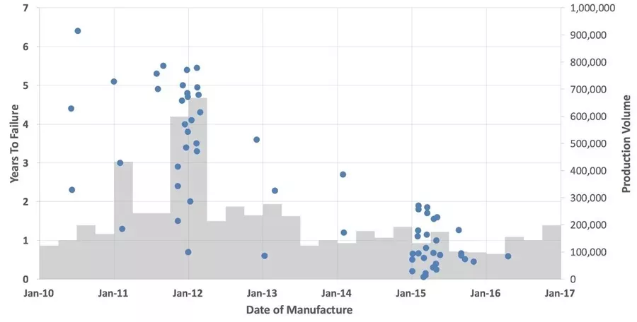
From this plot, we can clearly see a number of trends:
- Points nearer to the x-axis show infant-mortality issues, while points away from the x-axis may indicate end-of-life issues. We can see that the failure mechanism in the 2011 — 2012 window is related to wear-out, as the point density increases over time. In the first half of 2015, the failure could be early-life or possibly random failure.
- An increasing density of points indicates more failures for a particular manufacturing period. In the above example, both the production periods from October 2011 to March 2012 and the first half of 2015 had issues.
- In the first half of 2015, we see a high-density point cluster with low production. An engineering investigation may be warranted.
The production/return chart does have drawbacks in that the point-cloud format is not quantitative as much as it is intuitive. While the production/return chart does not quantitatively express the failure rate (e.g., the amount of product coming back divided by the production volume for any given period of production), viewers can get a good visual sense for the failure rate from the point density and production volumes.
Armed with this intuitive understanding, an investigator now can plot Weibull curves for populations or sub-populations of interest. For example, after evaluating the above production/return chart, an investigator may choose to further examine the production window from October 2011 to March 2012 to identify rolling design change or manufacturing process changes that could have affected product quality.
The above example illustrates how a manufacturer can use 1) production/return charts to visualize overall trends and identify sub-populations of interest and 2) Weibull charts to quantify the failure rates for given sub-populations. The combination of both techniques can help manufacturers understand the full story behind field return data and take focused action to address design or manufacturing issues.
How Exponent Can Help
Exponent's multidisciplinary team of engineers, scientists, and statisticians are backed by five decades of failure analysis experience. We can help manufacturers across a multitude of industries visualize and interpret field return data and build focused action plans to improve product quality.